
The Infatuation’s EEEEEATSCON Presented by Chase Sapphire® Festival website
Client
Chase + The Infatuation
My role
Experience Design Lead shaping content architecture, responsive UX, interaction models, systems thinking, prototyping
Location-specific programming
and daily schedules
+42% increase in session duration
2. Discovery
User Personas
Defined four user personas using qualitative interviews, attendee survey data, and behavioral analytics from previous EEEEEATSCON festivals.
The goal was to understand how different audience segments explored festival information, discovered vendors, and made ticketing decisions. These personas highlighted unique motivations, content needs, and mobile behaviors across Chase Sapphire cardholders, food-focused explorers, families, and social-driven festivalgoers. The insights shaped the site architecture, editorial tone, content hierarchy, and feature prioritization to ensure the experience felt intuitive, conversion-friendly, and personalized across all devices.
Chase Cardholder
A perks-driven festivalgoer who values exclusivity, early access, and premium experiences powered
by their Sapphire card.
Tech Savviness: High, regularly uses mobile apps like Chase Sapphire for updates and offers
Most Used Features: Promo codes, Early Entry Ticket, All You Can EEEEEAT
Looking For: Early access, VIP perks, and clear updates on benefits
Motivation: Shares exclusive access moments on social; values premium service experiences
3. Define & Refine
Food Enthusiast
An experience-seeker who plans their day around standout dishes, trending vendors, and anything worth posting about.
Tech Savviness: High, relies on event sites and food apps for trends and planning
Most Used Features: Event Lineup, Menu Details, Festival Guide
Looking For: Social interaction, trending vendors, and photogenic dishes
Motivation: Wants to discover, share, and experience the food scene firsthand
Research insights clarified how users explore festival content, discover vendors, search schedules, and transition into the ticketing experience. To translate these needs into a scalable product framework, I mapped the complete end to end journey across the EEEEEATSCON digital ecosystem. This included Infatuation editorial surfaces, city specific festival pages, Chase Sapphire touchpoints, ticketing flows, confirmation emails, and the broader partner and brand environment.
Iterating & Reframing
Select City
This early direction explored presenting cities with more equal visual weight to emphasize EEEEEATSCON’s multi city nature. Reviews showed that while the ecosystem was clear, users needed a stronger cue to understand where to start. This learning informed later designs that prioritized the active festival as the primary entry point.
FAQs
This iteration treated FAQs as a broad reference hub. Testing revealed that excess content and visual embellishment increased cognitive load when users were seeking quick answers. The outcome informed a more streamlined FAQ experience focused on clarity, speed, and reduced friction.
Navigation and Content Hierarchy
Early tests showed users jumping between schedules, vendors, and maps without a clear sense of priority. Some sections drew too much attention while others needed stronger anchoring. Refinements clarified hierarchy, ensured programming was consistently surfaced first, and aligned content patterns across all cities. This created more predictable paths and reduced unnecessary backtracking.
Thank you
Heatmaps revealed how users visually processed the Select City page and how quickly they identified the active festival. The interaction data showed where attention landed first, which elements consistently drew focus, and where hesitation appeared. Users gravitated toward the hero image and active city card, then scanned secondary markets for context.
These patterns validated the importance of clear hierarchy, strong labeling, and a prominent visual anchor for the live festival. Secondary markets received attention without competing for it, confirming the layout supported quick orientation while reinforcing the broader multi-city ecosystem.
Competing Entry Points
Shows broader scanning behavior before users identified the active festival. Attention dispersed across multiple city cards, making hierarchy feel less obvious and increasing the time spent deciding where to begin. This pattern reinforced the need for a stronger visual anchor to guide users toward the primary entry point.
Interactive itinerary and map tools
Giving attendees the ability to build personalized schedules, navigate festival grounds, and seamlessly move between vendors, stages, and experiences.
Version 2: Clear Active City Priority
Emphasized the active festival through a larger card, clearer labeling, and a direct call to action. Past markets remained visible for browsing but did not compete for attention. Users recognized the starting point immediately and appreciated contextual elements like recaps, menus, and previews.
Result
Navigation became faster and more confident. Users consistently selected the active city first, making this the strongest version for clarity, engagement, and overall flow.
Following launch, the next phase focused on expanding the site’s utility and deepening the attendee experience across every city. Insights from user behavior, stakeholder feedback, and on-site testing highlighted several opportunities to continue evolving the platform and strengthen both the planning journey and Chase Sapphire’s presence within it.
The design phase focused on translating research insights into a cohesive and conversion-driven festival experience that balanced clarity, scalability, and brand alignment. The system was built to support multi city rollouts, evolving programming, expanding vendor lists, and the high visibility required by Chase Sapphire partnerships.
Using a modular design approach, I created a flexible set of page patterns that adapted to each city’s unique needs while maintaining a consistent structure across schedules, lineups, vendor directories, maps, FAQ resources, and on-site experiences. Every layout prioritized discoverability and ease of navigation across mobile and desktop, with special emphasis on the mobile audience, which represented the majority of traffic.
The final system enabled rapid content updates, clearer paths to ticket purchase, stronger visibility for Chase cardholder perks, and a more intuitive journey from exploration through event day planning. The result was a scalable festival website that became the single source of truth for every attendee.
5. Deliver & Test
Our goal was to ensure the festival site worked as intuitively in the real world as it did in prototypes. We ran iterative QA across multiple devices, browsers, and screen sizes to confirm that schedules, vendor directories, ticket paths, and day-of logistics behaved exactly as intended. This process surfaced small but meaningful improvements that strengthened clarity, reinforced hierarchy, and ensured the experience felt fast and reliable for every attendee.
Interactive prototypes and live QA sessions revealed where users hesitated, which modules naturally pulled attention, and where labels or patterns needed refinement. These insights guided updates that improved discoverability, created smoother paths from early planning through event-day decisions, and supported new requests from partnerships and festival operations, including menus, perks, and on-site activations, without disrupting the overall structure.
1.
Heatmap Validation
6. Post-Launch Enhancements
The upcoming enhancements will center on
As the festival site evolved, iteration focused on improving discoverability without losing energy. Early versions explored different ways to balance editorial storytelling with the practical needs of planning across cities, schedules, and experiences.
These directions were not final solutions, but learning tools. Internal and external reviews surfaced where hierarchy broke down, where excitement overshadowed clarity, and where users needed more guidance. Each iteration informed sharper entry points, clearer structure, and stronger alignment between festival planning, brand voice, and Chase Sapphire visibility.
Each round sharpened the balance between inspiration and utility. We refined labeling, reorganized content blocks, and clarified pathways so users always understood what mattered most and where to go next. The result was a festival site that served as the central destination for EEEEEATSCON, supporting excitement before the event while making the journey to purchase and attend feel natural and intuitive.
Clearer navigation, stronger content hierarchy, and mobile-first layouts helped users stay on the site longer and reach key moments more efficiently.
8. Final Reflection
4. Shipped Design
1.
These personas grounded every decision that followed. They clarified what each audience valued, how they navigated content on mobile, and where friction appeared during festival discovery. Their motivations shaped the site architecture and content hierarchy, while their behaviors informed UX flows that balanced editorial storytelling with fast access to logistics. Together, they ensured the festival experience felt intuitive, conversion-ready, and personalized across every device.
2.
Information Architecture
A unified ecosystem map showing how users move through discovery, planning, ticketing, and post-purchase touchpoints across editorial content, festival pages, Chase Sapphire integrations, and transactional flows. This framework clarified system relationships and guided the structure of a scalable multi-city experience.
Homepage
This version explored a more editorial, content forward layout. While it aligned with brand storytelling, feedback showed it felt too restrained and made key planning actions less immediate. The takeaway was clear. Key art needed to lead, with faster access to programming and ticket paths.
Module and Label Refinements
Testing highlighted where labels felt ambiguous or modules blended together visually. Updates sharpened distinctions, improved scannability, and made it easier for attendees to compare vendors, browse lineups, and understand on-site experiences. These adjustments reduced hesitation and increased confidence at key decision points.
A/B Testing & Validation
3.
We ran focused A/B tests on the Select City page to measure how quickly users identified the active festival and moved into the correct experience. Each variation explored different hierarchy, card sizing, and interaction patterns to determine which structure made the starting point feel most obvious while still supporting past markets and recaps.
Testing revealed where people hesitated, what drew attention, and what created clarity. The final direction made the active city unmistakable while keeping the festival connected across markets, balancing functional entry with brand continuity.
Version 1: Uniform City Grid
This layout placed all cities in a grid with equal visual weight. Although the active market was distinguishable, users hesitated because the hierarchy did not clearly signal where to start. Some scanned the page longer than expected or tapped into past cities before locating the active festival.
Result
The multi-city story came through clearly, but directional clarity was weak. Users needed a stronger cue for where to begin.
Singular Entry Point
Highlights focused attention on the active festival. Users immediately gravitated toward the hero image, city label, and primary call to action, while secondary markets were treated as optional context. This pattern confirmed improved clarity, reduced hesitation, and faster entry into the live event.
Richer Chase exclusivity moments that enhance the cardholder journey
Creating clearer pathways to perks, early access opportunities, and premium on-site experiences that elevate the value of the Chase partnership.
Mapping the ecosystem revealed how extensive and interconnected the experience needed to be. Users frequently moved between editorial articles, vendor lists, schedules, maps, and ticketing tools without a clear path forward. We identified friction in program discovery, gaps in vendor and perk visibility, and missed opportunities to introduce Chase cardholder value. Mobile navigation often needed more direct paths, especially when users shifted between storytelling and transactional content.
This holistic view informed a unified Information Architecture that connected content, partnerships, and transactional flows into a single cohesive system. The model below illustrates how users move through discovery, planning, purchase, and post-festival follow-up, and how each touchpoint supports clarity and conversion across cities.
7. Measured Impact
Family-Oriented Attendee
A parent focused on smooth logistics and kid friendly programming who wants an easy, predictable festival day.
3.
2.
Real-time vendor and programming updates to help attendees adapt
Ensuring the site remains a reliable source of truth by pushing live updates for timing shifts, new experiences, and evolving daily lineups.

Users explored more vendor content, schedules, and programming details, spending significantly more time planning their festival day.

Tech Savviness: Moderate – uses mobile apps for shopping and family planning
Most Used Features: Festival Guide, Family Zones, FAQs, Event Lineup
Looking For: Smooth logistics, group registration, and kid-friendly info
Motivation: Easy event planning and peace of mind for the entire family
Improved discoverability and streamlined paths to purchase supported consistent sell-out performance for every city launch.
The redesigned EEEEEATSCON festival website delivered measurable improvements across engagement, performance, and attendee experience. By unifying editorial storytelling with clearer paths to ticket purchase, the new system increased user confidence, reduced friction, and strengthened the visibility of Chase Sapphire partnerships across all markets.
These outcomes demonstrated meaningful business impact across engagement, mobile performance, and operational consistency:
–28% bounce rate across key pages
Streamline the path to ticket purchase for an audience that is overwhelmingly mobile-first
Team
Product Manager, Developers, The Infatuation Editorial & Brand, Chase Sapphire Marketing & Partnerships
Sold-out events year after year
3.
Support evolving city-specific programming, schedules, vendors, and exclusive Chase cardholder moments

30% faster load times on mobile
Optimized layouts and lighter components resulted in noticeably improved mobile performance during peak traffic moments.
Timeline
2 months
Programming, and Perks Visibility
As festival teams finalized menus, vendor details, and Chase Sapphire perks, we expanded the system to support new content types. Enhancements made these sections more prominent, easier to browse, and simpler to update through the CMS. This ensured attendees could plan effectively while giving Chase Sapphire integrations stronger visibility across each city’s experience.
Adventurous Millennial
A social, mobile-first explorer chasing high
energy moments, quick decisions, and exciting shareable experiences.
Tech Savviness: High – highly mobile-first, FOMO-driven behavior
Most Used Features: Festival Guide, Experiences, Quick Registration
Looking For: Shareable content, dynamic energy, frictionless flows
Motivation: Wants fast access and bold, social-media-worthy moments
Lineup
This layout prioritized structure and completeness, but stakeholders felt it lacked the energy of the festival itself. The learning was that the lineup needed to feel more intuitive and expressive, not just informative, while still supporting fast scanning.

Homepage
FAQs
Accessibility toolbar
Sponsor Experiences
Elevated sense
of exclusivity
Chase cardholders engaged more deeply with perk-driven content, noting that the redesigned flow made the experience feel more exclusive and rewarding.
The redesigned festival website evolved into a scalable, conversion-driven ecosystem that improved attendee planning, strengthened Chase Sapphire integration, and delivered a measurable lift in both engagement and overall festival performance.
This project reinforced how UX can shape not only how people navigate an event, but how they feel about it. The challenge was creating a structure that could flex across cities and partnerships while still delivering a clear, energizing path for attendees planning their festival experience.
Building a system that supported high traffic, constant content updates, and multiple internal teams required thoughtful problem solving and a strong foundation for scalability. The most rewarding part was seeing how a unified structure reduced confusion, improved planning, and gave attendees a single destination they could trust as the festival evolved.
This work reminded me why I love product design. It combined systems thinking, real user needs, and the excitement of a live event into an experience that helped people feel informed and ready for the day ahead.
Lineup
Competitive Positioning
Shows where the EEEEEATSCON festival ecosystem sits within the broader food and cultural event landscape.
Positioned within a premium national category that blends culinary programming with strong brand and sponsorship integrations
Differentiates itself through a multi-dimensional experience that includes food, live demos, talent, activations, and Chase perks
Stands apart from traditional food-only festivals by pairing editorial storytelling with real-world experiential programming
Integrates partners, cardholder benefits, and cultural relevance to elevate the festival beyond a single-city event
Reinforces The Infatuation and Chase Sapphire as co-owners of a culturally resonant festival platform
These insights reinforced the need for a flexible content architecture that could support rapid updates across multiple cities while strengthening the connection between festival content and Infatuation editorial coverage. The website needed to bridge both worlds: a high-energy editorial experience and a streamlined path to purchase that reduced friction on mobile. This research laid the foundation for a responsive, content-driven system that could evolve city by city and support the business goals of both Chase Sapphire and The Infatuation.
Culinary talent, vendors, and
immersive festival activations
The site needed to bring together all festival storytelling and utility into one cohesive experience. It had to spotlight each city’s programming, elevate exclusive Chase Sapphire perks, and showcase the culinary lineup in an editorial yet actionable way. The framework needed to support rapid updates, mobile-first navigation, and city-by-city scalability. This foundation enabled the website to stay consistent, flexible, and aligned with both The Infatuation’s voice and Chase Sapphire’s partnership goals.
Select city
Map & Directory
Festival Alert
To guide design decisions for the festival website, I combined qualitative interviews, attendee survey data, and behavioral analytics from previous EEEEEATSCON events. The goal was to understand how food-focused millennials, Chase Sapphire cardholders, and loyal Infatuation readers explored festival information, discovered vendors, and moved toward ticket purchase. This research revealed expectations around mobile performance, clarity of content, and the need for fast access to logistics and vendor details.
Patterns emerged that shaped the direction of the experience. Attendees consistently searched for vendor lists, programming schedules, maps, and logistics, while Infatuation readers looked for deeper editorial context to help them plan their day. Chase Sapphire audiences expected strong visibility of exclusive perks. Stakeholders emphasized the importance of balancing high-energy editorial storytelling with transactional clarity and ensuring each city launch could scale quickly while remaining consistent with the brand.
1. Problem
As the Lead UX/UI Designer, I was responsible for reimagining the responsive, conversion-driven marketing website for EEEEEATSCON, a multi-city food festival presented by Chase Sapphire and produced by The Infatuation.
The challenge was to design a flexible and scalable festival website that could support a high-traffic editorial and experiential ecosystem, promote Chase Sapphire partnerships, and maintain The Infatuation’s bold editorial tone while driving strong ticket conversions across all devices.
The website needed to do far more than sell tickets. It had to educate attendees about the full festival experience, highlight exclusive Chase Sapphire perks, drive discovery of Infatuation editorial content, and clearly communicate day-by-day and hour-by-hour programming. This included culinary lineups, live experiences, festival maps, FAQ resources, vendor details, and real-time updates that could shift by city
Reflect The Infatuation’s energetic editorial voice while meeting Chase Sapphire’s partnership standards
The festival site needed to promote
Exclusive Chase Sapphire cardholder
perks and on-site brand experiences
2.
The goals were clear
1.
UX Opportunities Ven Diagram
Highlights where user needs, business goals, and technical feasibility overlapped to define the core opportunities for a multi-city festival website.
Users needed fast access to programming details, vendor lineups, maps, and exclusive Chase perks
Business goals centered on promoting partnerships, showcasing brand activations, and driving both ticket conversion and editorial engagement
Technical feasibility was supported by a flexible CMS, scalable templates, and a system built to support rapid city launches
The intersection created space for a responsive festival experience that balanced content and commerce
These aligned priorities established a clear direction for discoverability, clarity, and long-term scalability across festivals
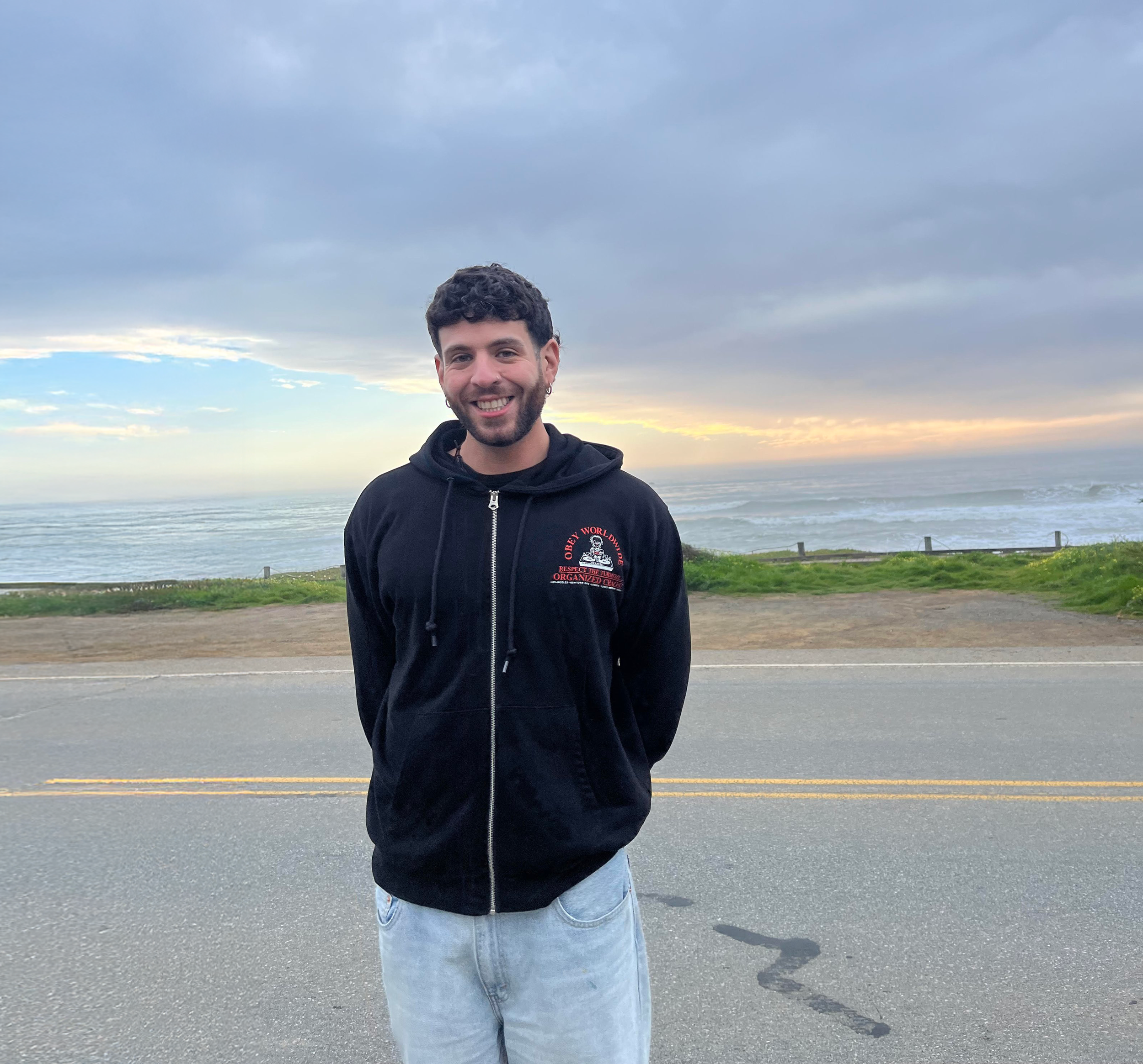
Hey, I’m Mario
A UX designer actively looking for new opportunities. I’m excited to bring thoughtful, research-driven design driven by purpose, creativity, and meaningful impact.
Reach me at mfp181@gmail.com.